This article demonstrates a technique to get content in front of visitors as quickly as possible by asynchronously downloading stylesheets to prevent them from blocking page render.
Warning! I posted this with the best of intentions, but it would be irresponsible not to make readers aware of the following issues. Community feedback is coming in thick and fast (something I'm very grateful for) and it's becoming apparent that this technique isn't as robust as I'd hoped. Despite my testing and using it successfully in my own work, many developers are seeing issues in IE and Firefox (apparently crashing FF beta) while others are reporting success in Chrome and Safari. My advice right now is: DON'T use this in production. I am planning to digest the feedback and will update this post with any relevant information.
The principles behind these techniques aren't new. Filament group, for example, have published great content on loading CSS and fonts. I've written this article to document my thoughts and ideas for loading non-blocking resources.
The trick to triggering an asynchronous stylesheet download is to use a <link> element and set an invalid value for the media attribute (I'm using media="none", but any value will do). When a media query evaluates to false, the browser will still download the stylesheet, but it won't wait for the content to be available before rendering the page.
<link rel="stylesheet" href="css.css" media="none">Once the stylesheet has finished downloading the media attribute must be set to a valid value so the style rules will be applied to the document. The onload event is used to switch the media property to all:
<link rel="stylesheet" href="css.css" media="none" onload="if(media!='all')media='all'">This method of loading CSS will deliver useable content to visitors much quicker than the standard approach. Critical CSS can still be served with the usual blocking approach (or you can inline it for ultimate performance) and non-critical styles can be progressively downloaded and applied later in the parsing / rendering process.
This technique uses JavaScript, but you can cater for non-JavaScript browsers by wrapping the equivalent blocking <link> elements in a <noscript> element:
<link rel="stylesheet" href="css.css" media="none" onload="if(media!='all')media='all'">
<noscript><link rel="stylesheet" href="css.css"></noscript>
There is a side-effect to this technique. Once a non-blocking stylesheet has finished downloading the document will be repainted to reflect any new rules it defines. Injecting new styles into the page can trigger content reflows, but this is only really an issue for the first page load with an unprimed cache. As with all things related to performance, you'll need to make a judgement call on when the need to control a reflow outweighs the potential speed gain.
Using non-blocking CSS to load fonts
Fonts are an issue for first-paint performance, they are a blocking resource and can render text invisible while they download . Using the non-blocking link example above, it's possible to download a stylesheet containing font data in the background, unblocking the page render:
<link rel="stylesheet" href="main.css">
<link rel="stylesheet" href="font.css" media="none" onload="if(media!='all')media='all'">
font.css contains a base64 encoded WOFF version of the Merriweather font.
@font-face {
  font-family: Merriweather;
  font-style: normal;
  font-weight: 400;
  src: local('Merriweather'), url('data:application/x-font-woff;charset=utf-8;base64,...')
}
main.css contains all the rules required to style the site. Here's the font declaration:
body {
  font-family: Merriweather, "Lucida Grande", ...;
}
While the font is downloading, the first matching fallback font (Lucida Grande, in this case) is used to render the page content. Once the font stylesheet is applied, Merriweather will be used. I try to ensure the fallback shares similar layout characteristics to the preferred font, so that the inevitable reflow is as subtle as possible.
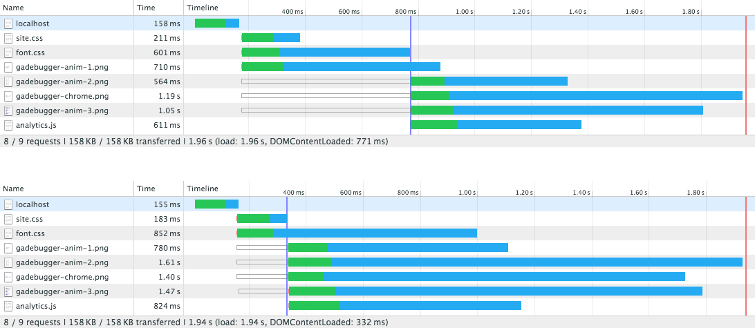
I'm testing blocking vs non-blocking using my Google Analytics Debugger site in Chrome over a simulated 3G connection. Local testing produces the following network graphs; notice the DOMContentLoaded event fires around 450ms earlier and assets begin downloading sooner when non-blocking is used:
Deploying this to a test server and running webpagetest with 3G connection shaping produces the following timeline:
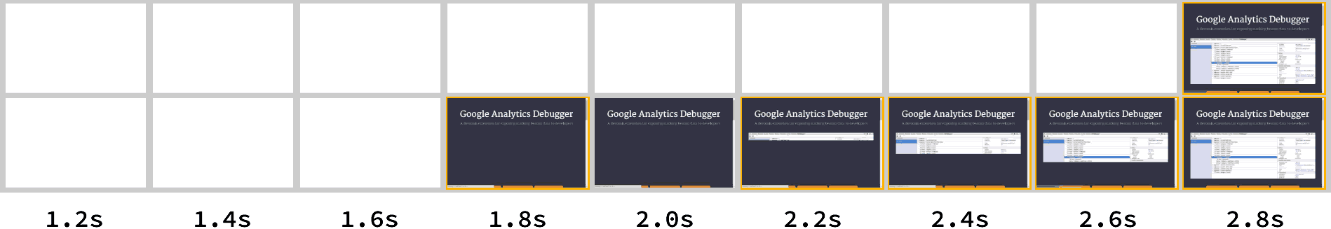
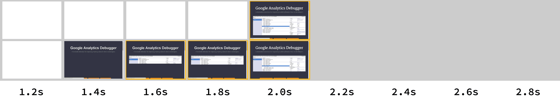
Both methods take 2.8 seconds to completely render the page, but the non-blocking method causes painting to begin a second earlier than the normal blocking approach. Running the same test with the main stylesheet inlined shows a 0.7 second gain when non-blocking CSS is used to serve the font:
This technique does work well for fonts but I recommend keeping an eye on the new CSS Font Loading Module, which gives far greater control over font loading.
Summary
Loading fonts is one example of applying this non-blocking technique, but it could also be used for other purposes, such as separating JavaScript enhanced styles from core CSS.
I've started to experiment with the idea of breaking up CSS into scaffolding (core layout) and presentation (everything else), allowing vital page layout to block the page render and have the visual styles arrive later.
Thanks to Mathias Bynens for taking the time to share a shortened version of the <link> onload handler.
Update: 1 Apr 2015
- This method does not work in Android < 4.4 because the onload handler does not fire when content is available - I'm looking into a work around for this.
- Some browsers appear to still block CSS render despite
media="none". This means CSS loads as it usually would — I'm looking into this.