Fixing an element containing site navigation or branding to the top or bottom of the viewport is a common design trend. Most solutions I've come across use a combination of fixed positioning and JavaScript to mitigate any side-effects. I've found a better solution that uses 'sticky' positioning...
The common method — position: fixed
Setting an element's CSS position property to fixed is the most popular way of clamping it to the viewport. Using fixed positioning will render an element at the given position regardless of the viewport scroll offsets.
There is an issue with this approach though: an element with a fixed position is removed from the natural document flow, causing the space it would normally occupy to collapse. Any statically positioned content will now render underneath the fixed element.
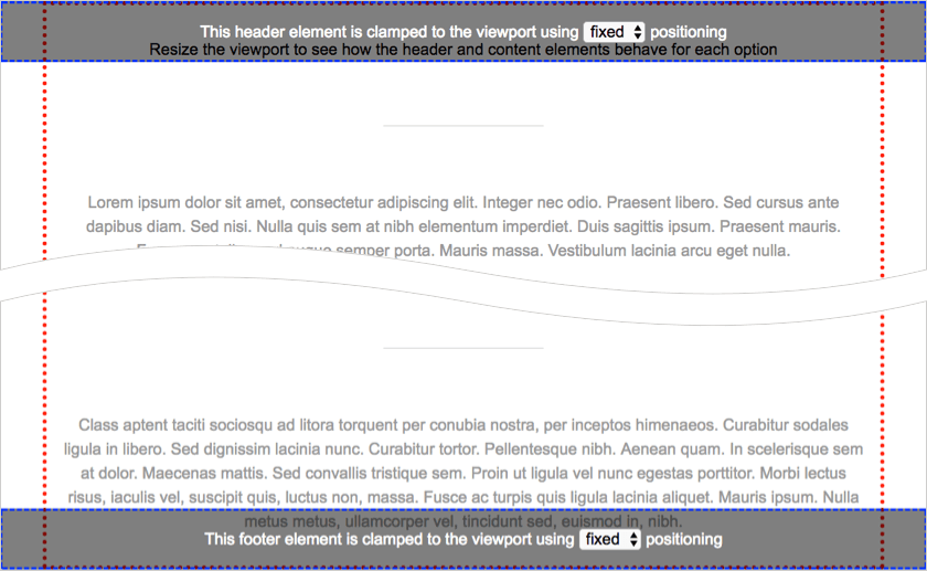
To counter this, the remaining content has to be nudged around to account for the original space. This is usually acheived by calculating the height of the clamped content using JavaScript or picking an arbitary number to set as the margin-top value in CSS:
.header {
  position: fixed;
  top: 0;
}

.main {
  margin-top: 4em; /* nudge content down */
}
There's another problem to contend with. If the viewport is resized, the clamped element could reflow. In this case the clamped element's content area will need to be recaluclated and used to nudge the static content into place again.
A better way — position: sticky
If you've not come across sticky positioning I recommend reading the CSS position property documentation on MDN or the W3C CSS Positioned Layout Module Spec.
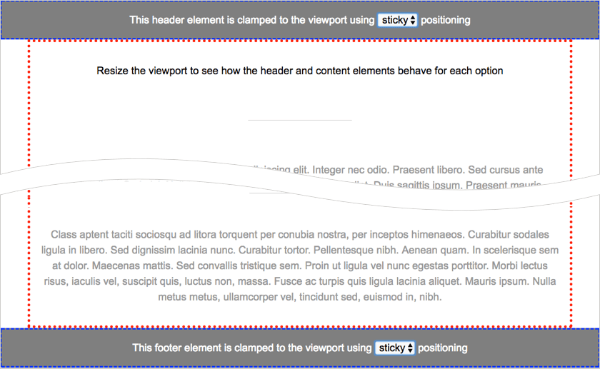
In simple terms, setting position to sticky will render an element statically until it's bounding box exceeds a predefined area of a scrollable parent element or the viewport, at which point the element becomes fixed. However — unlike an element positioned using the fixed value — the space occupied by the element in the document doesn't collapse.
In the case of a page header, the containing element will be towards the top of the DOM and the predefined area will be set to the top of the viewport:
.header {
  position: sticky;
  top: 0;
}
For a footer, the containing element will be towards the end of the DOM and the the predefined area will be the bottom of the viewport:
.footer {
  position: sticky;
  bottom: 0;
}
In these configurations elements will appear to behave identically to an element with fixed positioning — except that the remaining content will flow as if the elements are statically positioned and therefore automatically adapt if the header or footer reflows.
Browser Support
Sticky positioning is supported in: Firefox 32+, Chrome 56+, Opera 42+ and Edge 16+. Safari has supported the feature through a vendor prefix (position: -webkit-sticky) on MacOS since 7.1 and iOS since 8. As with all vendor prefixes, make sure you add it before the unprefixed version:
.nav {
  position: -webkit-sticky;
  position: sticky;
  top: 0
}
For up-to-date support information, please check caniuse.
Fallbacks
Although general support for position sticky is pretty good, it's still a relatively new feature to mobile browsers. To ensure your styles work across as many browsers as possible, I recommend using @supports to feature test and only apply the element clamping styles if the browser can honour them:
@supports (position: sticky) {
  .nav {
    position: sticky;
    top: 0
  }

  /* other clamped element style changes go here... */
}
In this case, if the browser doesn't support the sticky value, the .nav element will render statically and scroll with the rest of the page. However, if your design really must have clamped content, you could mix approaches and opt for something like this:
/* older browsers */
.nav {
  position: fixed;
  top: 0;
}
.main {
  margin-top: 4em;
}

/* modern browsers */
@supports (position: sticky) {
  .nav {
    position: sticky;
  }
  .main {
    margin-top: 0;
  }

  /* other clamped element style changes go here... */
}
That's it
I hope you find this technique useful. If you have any comments or questions you can reach me on twitter.