CSS transforms make it easy to manipulate an element in 3D space without worrying about the complex maths involved. But what if you want do more than transform elements? How can you shade an element or test if two transformed elements intersect? To do that you need access to the elements vertex data — unfortunately that data doesn’t exist.
In this post I’m going to explain how to generate vertex data for elements transformed using CSS and demonstrate how to use this data to shade elements using a light source. This research made the lighting and shadow techniques in my CSS3 FPS tech demo possible. (Also, if you recently attended Hacker News London and heard my CSS 3D talk, this is the blog post as promised).
Before we can calculate anything we need to set a few ground rules. Firstly, all elements must be absolutely positioned in the centre of the viewport and can only be moved using CSS transforms. Secondly, when an element is added to the viewport I ensure its position reference and transform origins are the same — it makes transforms easier to work with. By default, elements are positioned relative to their corners (using the top, left
bottom or right properties) and transforms are relative to the centre point. I prefer to work with the centre point as my reference, normalising the origins by pulling the element up by half its height and left by half its width using negative margins:
<style>
#face {
width: 300px;
height: 200px;
margin: -100px -150px; /* pull element into position */
}
</style>
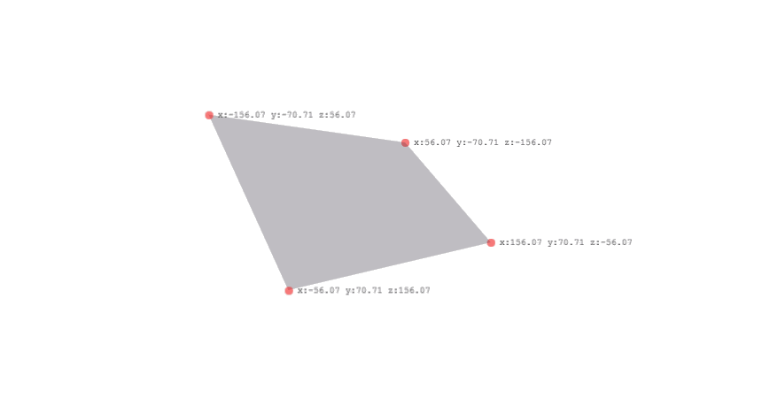
<div id="face"></div>With both origins aligned we can determine the 4 vertices for the corners of the element. The convention is to define the vertices in a clockwise direction as points a, b, c and d with point a as the top left corner of the element, b as the top right, c as bottom right and d as bottom left.
The first step is to ignore any CSS transforms and calculate the corner positions of the element in its flat 2D state. To do this we need to determine the element’s width and height and halve them. These values are then used to set the x and y property of each vertex. Corners above and to the left of the centre will have negative values and those below and to the right and will have positive values. The z property is always 0 as this element only exists in 2D space at the moment.
These simple calculations are handled by the following function:
function computeVertexData (elem) {
    var w = elem.offsetWidth / 2,
        h = elem.offsetHeight / 2,
        v = {
            a: {x: -w, y: -h, z: 0},
            b: {x: w, y: -h, z: 0},
            c: {x: w, y: h, z: 0},
            d: {x: -w, y: h, z: 0}
        };
    return v;
}
If we call computeVertexData, passing in our 300 x 200 element, it will return the following vertex data:
{
    a: {x: -150, y: -100, z: 0},     // top left corner
    b: {x: 150, y: -100, z: 0},      // top right corner
    c: {x: 150, y: 100, z: 0},       // bottom right corner
    d: {x: -150, y: 100, z: 0}       // bottom left corner
}
To test the function we can add four <div> elements to the DOM and set their transform properties to the calculated values above, positioning them over the corners of the element:
// compute the vertex data
var v = computeVertexData(elem);

// create a new vertex marker element
var markerA = document.createElement("div");
markerA.style.transform = "translate3d(" + v.a.x + "px, " + v.a.y + "px, " + v.a.z + "px);";
scene.appendChild(markerA);

// ... repeat for B, C and D vertices ...Accounting for transforms
Now that we have the vertex data for a 2D element we need to determine the rotation and translation of the element in 3D space by decomposing its transform matrix. We do this by querying the transform property of the element using window.getComputedStyle:
var matrix = getComputedStyle(elem, null).transform; // vendor prefixed variants omittedThe resulting value (a string) will depend on the transform that was applied to the element:
none– no transform was applied to the elementmatrix(m11, m12, ... , m23)– 2D transform was applied to the elementmatrix3d(m11, m12, m13, ... , m44)– a 3D transform was applied to the element
The string is split into its component parts and converted into a 4×4 matrix (see the parseMatrix function to see how this is achieved) which can be decomposed to determine the original rotation and translation of the element.
Here is the function that handles the matrix decomposition for translation and rotation:
function getTransform (elem) {
    var matrix = parseMatrix(getComputedStyle(elem, null).transform),
        rotateY = Math.asin(-matrix.m13),
        rotateX,
        rotateZ;

    if (Math.cos(rotateY) !== 0) {
        rotateX = Math.atan2(matrix.m23, matrix.m33);
        rotateZ = Math.atan2(matrix.m12, matrix.m11);
    } else {
        rotateX = Math.atan2(-matrix.m31, matrix.m22);
        rotateZ = 0;
    }
    return {
        rotate: { x: rotateX, y: rotateY, z: rotateZ },
        translate: { x: matrix.m41, y: matrix.m42, z: matrix.m43 }
    };
}
Now that we can calculate the rotation and translation values of an element we can apply a CSS transform to our element and update its flat 2D vertex data with the 3D components.
<style>
    #face {
        width: 300px;
        height: 200px;
        margin: -100px -150px;
        transform: translateX(50px) translateY(-20px) translateZ(100px);
    }
</style>
<div id="face"></div>
Calling getTransform(document.getElementById("face")) will return:
{
    rotate: {x: 0, y: 0, z: 0},
    translate: {x: 50, y: -20, z: 100}
}
If we add the x, y and z components of the translate property to the x, y and z components of the flat vertex data we end up with:
{
    a: {x: -100, y: -120, z: 100},     // x = -150 + 50   y = -100 + -20   z = 0 + 100
    b: {x: 200, y: -120, z: 100},      // x =  150 + 50   y = -100 + -20   z = 0 + 100
    c: {x: 200, y: 80, z: 100},        // x =  150 + 50   y =  100 + -20   z = 0 + 100
    d: {x: -100, y: 80, z: 100}        // x = -150 + 50   y =  100 + -20   z = 0 + 100
}
We do the same for rotation, albeit with more complicated maths (see demo), and voila! our a, b, c and d vertices are now real coordinates in 3D space.
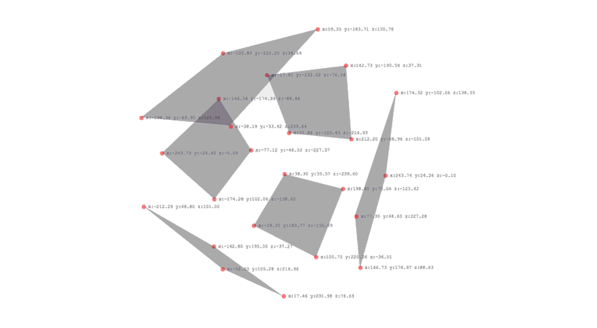
Complex objects
Until now we have been working with a single element but we also have to account for nesting. Elements are transformed relative to their parent so we need to walk up the DOM tree and add parent transforms to the vertex data. Once we have accounted for ancestor transforms, our final computeVertexData function looks like this:
function computeVertexData (elem) {
    var w = elem.offsetWidth / 2,
        h = elem.offsetHeight / 2,
        v = {
            a: { x: -w, y: -h, z: 0 },
            b: { x: w, y: -h, z: 0 },
            c: { x: w, y: h, z: 0 },
            d: { x: -w, y: h, z: 0 }
        },
        transform;

    // Walk up the DOM and apply parent element transforms to each vertex
    while (elem.nodeType === 1) {
        transform = getTransform(elem);
        v.a = addVectors(rotateVector(v.a, transform.rotate), transform.translate);
        v.b = addVectors(rotateVector(v.b, transform.rotate), transform.translate);
        v.c = addVectors(rotateVector(v.c, transform.rotate), transform.translate);
        v.d = addVectors(rotateVector(v.d, transform.rotate), transform.translate);
        elem = elem.parentNode;
    }
    return v;
}
The following demo shows nested transforms in action. It features an exploded cube that rotates using a CSS animation. For each animation frame the face vertex data is recalculated and repainted to reflect the transform of the parent element.
Using vertex data to shade faces
Now we have the vertex data for our element we can use established, well documented techniques for calculating light, shadows, collisions etc. I’m going to keep things simple and implement flat shading. We’re going to need a small JavaScript library to help with the vector maths (I’m using my own, vect3.js) and a tutorial to explain how to implement lighting.
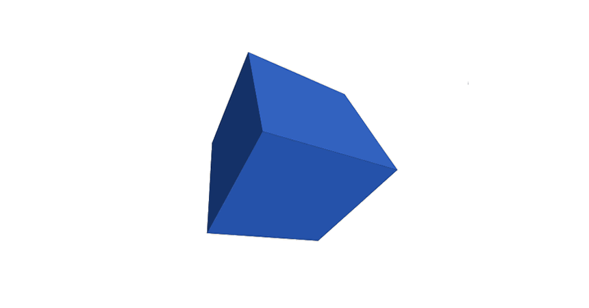
Did you read the tutorial? — I didn’t think so. Well, it doesn’t matter for now. Essentially, for each element we need to determine its normal, its centre point and the direction to the light. We then take the dot product of the normal and direction vectors to determine how similar they are. The more similar, the more light the element receives. Here’s the implementation:
// Select the light
var light = document.getElementById("light");

// Select the faces
var faces = [].slice.call(document.querySelectorAll(".face"));

// Get the light position
var lightPosition = getTransform(light).translate;

// Light each face
faces.forEach(function (face, i) {
    var vertices = computeVertexData(face),
        faceCenter = Vect3.divs(Vect3.sub(vertices.c, vertices.a), 2),
        faceNormal = Vect3.normalize(Vect3.cross(Vect3.sub(vertices.b, vertices.a), Vect3.sub(vertices.c, vertices.a))),
        direction = Vect3.normalize(Vect3.sub(lightPosition, faceCenter)),
        amount = 1 - Math.max(0, Vect3.dot(faceNormal, direction)).toFixed(3);

    face.style.backgroundImage = "linear-gradient(rgba(0,0,0," + amount + "), rgba(0,0,0," + amount + "))";
});
To shade the element I’m using a black linear-gradient and varying the alpha channel values to control how much of the background-color bleeds through. See my Creating 3D worlds with HTML and CSS post for more information on the technique.
Shading complex objects
Let’s shade something a little more complicated. Recently, Julian Garnier released his CSS editor Tridiv which comes with a X-Wing model — let’s use that.
The X-Wing model has 297 faces and a reasonably deep DOM tree. Shading this many elements at once brings the browser to its knees resulting in a dismal 2-3 FPS at best. I think we can do a little better than that.
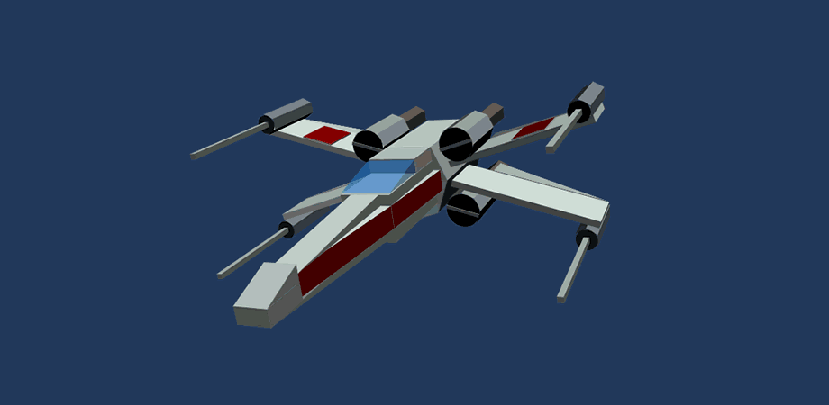
It’s optimisation time!
Running a quick profile in Chrome developer tools reveals that calls to computeVertexData are the biggest bottleneck. The function queries the DOM triggering multiple style recalculations (or reflows). It then decomposes the matrix of the element and its ancestors to determine the final transform calculations.
Instead of doing this work for every animation frame we can calculate most of what we need upfront. Pre-calculating the vertex data will remove all computeVertexData calls from the rendering loop, eradicating the DOM reflow bottlenecks.
// Grab the X-Wing element
var xWing = document.querySelector(".scene");

// Precalculate the normals and centres for each face
var faces = [].slice.call(xWing.querySelectorAll(".face")).map(function (face) {
    var verticies = computeVertexData(face);
    return {
        verticies: verticies,
        normal: Vect3.normalize(Vect3.cross(Vect3.sub(verticies.b, verticies.a), Vect3.sub(verticies.c, verticies.a))),
        center: Vect3.divs(Vect3.sub(verticies.c, verticies.a), 2),
        elem: face
    };
});
Now we have pre-calculated the normal and centre of each face, the render loop has to extract the transform components of the X-Wing wrapper element and add them to the pre-calculated face values. I’m also storing the last calculated light value for each face so I can check if it actually changed between frames before committing to a DOM update. These changes boost rendering performance to around 30 FPS.
function render() {
    var faceNormal, faceCenter, direction, amount,
        xwingTransform = getTransform(xWing),
        lightTransform = getTransform(light);

    faces.forEach(function (face) {
        // add the X-Wing translations to each face
        faceNormal = Vect3.rotate(face.normal, xwingTransform.rotate);
        faceCenter = Vect3.add(face.center, xwingTransform.translate);
        faceCenter = Vect3.rotate(faceCenter, xwingTransform.translate);
        direction = Vect3.normalize(Vect3.sub(lightTransform.translate, faceCenter));
        amount = 1 - Math.max(0, Vect3.dot(faceNormal, direction)).toFixed(2);

        // only repaint if the light changed
        if (face.light != amount) {
            face.light = amount;
            face.elem.style.backgroundImage = "linear-gradient(rgba(0,0,0," + amount + "),rgba(0,0,0," + amount + "))";
        }
    });
}
There’s still room for improvement. Recalculating the normals and translations for each face, every frame quickly eats up precious processing time. We’re performing these calculations to determine the position of 279 faces relative to a light source, so why not just move the light instead? Decomposing and inverting the transforms applied to the X-Wing wrapper and applying them to the light source means we only need to perform a single translation calculation per frame.
function render() {
    var xwingTransform = getTransform(xWing),
        lightTransform = getTransform(light),
        lightPosition = Vect3.rotate(lightTransform.translate, Vect3.muls(xwingTransform.rotate, -1));

    faces.forEach(function (face) {
        var direction = Vect3.normalize(Vect3.sub(lightPosition, face.center));
        var amount = 1 - Math.max(0, Vect3.dot(face.normal, direction)).toFixed(2);
        if (face.light != amount) {
            face.light = amount;
            face.elem.style.backgroundImage = "linear-gradient(rgba(0,0,0," + amount + "),rgba(0,0,0," + amount + "))";
        }
    });
}
The final change was to add a throttle to the render function so we can bail-out after a specific amount of time — 5ms in this case. This allows the renderer to do as much work as it can yet keep frame rates as high as possible (60FPS in Chrome / Safari).
This approach means the model will always rotate and translate at fast as the browser can manage but the shading is progressively generated over 2 or 3 frames. This is a great trick to use if you’re wrestling with multiple DOM updates.
var nextFaceIndex = 0;   // store the render counter

function render (startTime) {
    var face, direction, amount,
        faceNum = 0, faceCount = faces.length,
        xwingTransform = getTransform(xWing),
        lightTransform = getTransform(light),
        lightPosition = Vect3.rotate(lightTransform.translate, Vect3.muls(xwingTransform.rotate, -1));

    while (++faceNum < faceCount && performance.now() - startTime <= 5) {
        face = faces[nextFaceIndex];
        direction = Vect3.normalize(Vect3.sub(lightPosition, face.center));
        amount = 1 - Math.max(0, Vect3.dot(face.normal, direction)).toFixed(2);
        if (face.light != amount) {
            face.light = amount
            face.elem.style.backgroundImage = "linear-gradient(rgba(0,0,0," + amount + "),rgba(0,0,0," + amount + "))";
        }
        nextFaceIndex = (nextFaceIndex + 1) % faceCount;
    }
}That's it
...phew! I appreciate the content of this post may not be everyone's cup of tea but if you stuck with it, thanks for reading and I hope you found it interesting.
I can't believe noone has seen this and wanted to comment.
This is great stuff. I've been doing some experimentation myself:
At HoustonJS (houstonjs.com), I gave a talk on building a 3D engine with JavaScript and SVG. Hence, it works cross-platform, and works pretty smoothly. Here is the info on the talk:
meetup.com/…/136589142 vimeo.com/74150629 matthiasak.github.io/Building-a-Rudimentary-3D-Engine-with-SVG
This was just awesome, it's inspiring to see this kind of work. Can't help but imagine what we'll be doing inside a browser in 5 years time. Thank you for that enlightening tutorial.
Hmm,
I am not quite content with the outcome on Firefox Nightly. See db.tt/Nw1O94ca.
Is it Firefox or the demo?
That's a known issue with Firefox and z sorting of transformed elements.